Colours this season transcend cultural and gender norms. Vivid brights give way to excitement and optimism, though quiet stability prevails in this season’s palette. For Spring 2016 there are truly no perceivable distinctions in colour choices between the men’s and women’s collections, both of which focus on a desire to breathe and reflect, then play.
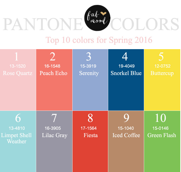
Top 10 Pantone for Spring 2016
1. Rose Quartz 13-1520 Percentage of designers who used this color: 22.55
The soothing, calming nature of colors in the Spring collections are led by Rose Quartz, a persuasive yet gentle tone that conveys compassion and a sense of composure. Like a serene sunset, flushed cheek or budding flower, Rose Quartz reminds us to reflect on our surroundings during the busy but lighthearted spring and summer months.
“This really is a beautiful pink that will radiate well on the skin for women as well as men,” Eiseman said. “Women can always be helped along by cosmetics, but guys have to rely on the colors they’re wearing to sometimes make them look a little healthier.”
2. Peach Echo 16-1548 Percentage of designers who used this color: 19.87
“We know the oranges have been hanging in there even though historically orange is a color that comes and goes. Peach Echo is a very warm, friendly and accessible color,” Eiseman said.
3. Serenity 15-3919 Percentage of designers who used this color: 15.86
Weightless and airy, like the expanse of the blue sky above us, Serenity comforts with a calming effect, bringing a feeling of respite even in turbulent times. A transcendent blue, Serenity provides us with a naturally connected sense of space.
“As the name suggests, Serenity is a calming color that plays to the whole idea that we know we’re still living in turbulent times. Blues simply relay that feeling of relaxation,” Eiseman said.
4. Snorkel Blue 19-4049 Percentage of designers who used this color: 15.21
A maritime-inspired blue, Snorkel Blue plays in the navy family, but with a happier, more energetic context. The name alone implies a relaxing vacation and encourages escape. It is striking yet still, with lots of activity bursting from its undertones.
Eiseman said this shade is “meant to be a bit more fun, less serious than navy, and serve as one of the anchor colors for the spring palette.”
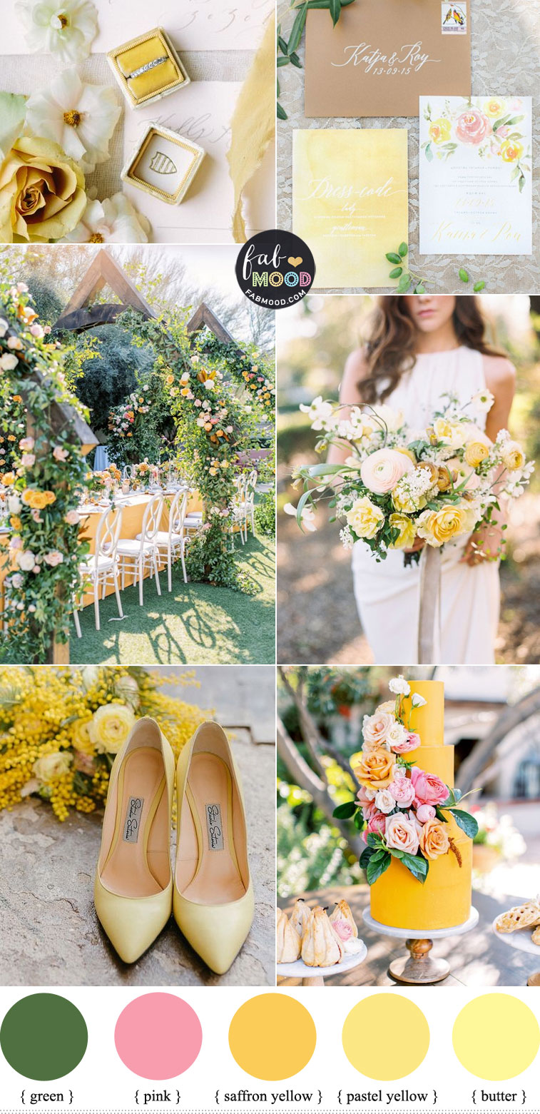
5. Buttercup 12-0752 Percentage of designers who used this color: 11.45
“Buttercup is all about sunlight, happiness and cheer — this one just speaks to give us a ray of sunshine, something to be hopeful about. It really energizes,” Eiseman said.
6. Limpet Shell 13-4810 Percentage of designers who used this color: 11.23
A shade of aqua that leans toward the green family, Limpet Shell is clear, clean and defined. Suggestive of clarity and freshness, its crisp and modern influences evoke a deliberate, mindful tranquility.
“Lovely and refreshing,” Limpet Shell is a blue that has a slightly green twinge, according to Eiseman. Given the number of news stories about climate change concerns, it’s not surprising that in recent seasons many people are instinctively reaching for cooler colors and blues, she added.
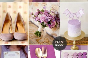
7. Lilac Gray 16-3905 Percentage of designers who used this color: 9.78
“There is a need for neutrals every season and this one has a hint of the purple family that is soft and subtle,” Eiseman said. “In light of the state of the economy, people are still mindful about the way they spend their money. If they invested in gray in recent seasons, as many people have, this is a color that is not going to say to them, ‘Oh, that’s so yesterday — I have to get rid of that.’”
8. Fiesta 17-1564 Percentage of designers who used this color: 8.99
“The south-of-the-border influence really plays heavily into this particular shade of red, which is more warm-based than a cha, cha, cha red. It’s very free-spirited,” Eiseman said.
9. Iced Coffee 15-1040 Percentage of designers who used this color: 8.92
A transitional color that will take us through the seasons, Iced Coffee manifests as another strong neutral for the season. With its natural earthy quality, the softness and subtlety of Iced Coffee creates a stable foundation when combined with the rest of this season’s palette.
“With a tan disposition, Iced Coffee has a warmth that combines well with everything else,” Eiseman said.
10. Green Flash 15-0146 Percentage of designers who used this color: 8.68
Green Flash calls on its wearer to explore, push the envelope and escape the mundane, radiating an openness that combines with the rest of the palette in unexpected but serendipitous ways. The popularity of this brilliant hue is representative of nature’s persistent influence even in urban environments, a trend continuing to inspire designers.



Superb, what a web site it is! This weblog provides useful facts to us, keep it up.
Thank you a lot for giving everyone a very special chance to read from this blog. It is always awesome plus full of info.
Great info! thanks for sharing
I am wanting the limpet shell color as my bridesmaid dresses but can’t find where to purchase them…can you help?! Thanks!
Hi Breanay,
I’ve found in shades of Limpet shell at dessy , one is called “spa” color – a slightly darker than another one called “coastal”
Here you go – Spa : dessy.com/dresses/bridesmaid/2943/#.V7oYbygrLIU
Hope this help 🙂
Kind regards
Ninize xoxo