

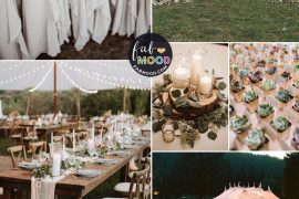
Pantone has released their report on the colour trends ruling the runways for the spring 2017 collections, and we are excited to share their top 10 colours Pantone Spring 2017 to help inspire your wedding theme! In the Fashion Week spring collection debuts, we saw a lot of earthtones, with a few pops of vibrant spring colours. “One of the things that we saw this year was a renewed sense of imagination in which colour was appearing in context that was different than the traditional,” said Leatrice Eiseman, Executive Director of the Pantone Colour Institute.
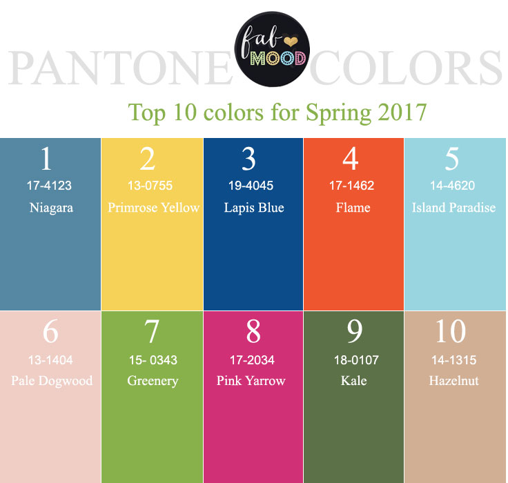
Pantone Spring 2017
Niagara:Inspired by the blue of the waterfalls of Niagara, this “comfortable and dependable” hue is reminiscent of blue denim. This colour, like your favorite jeans, should give you peace of mind and a sense of effortlessness!
Primrose Yellow: If cool blue isn’t for you, how about the warmth of Primrose Yellow, offering the opportunity to play with the colours of the sunset and the ambience of vitality, joy, and warmth.
Lapis Blue: Named for the semi-precious stone lapis lazuli which has been highly valued for its intense vibrant colour since antiquity, using Lapis Blue to lead your wedding colour palette instills a sense of confidence and boldness.
Flame: If the soft warmth of Primrose Yellow isn’t intense enough for you, try throwing in some red-hot, red-orange Flame! A fun, flamboyant colour to use in detail accents, especially if you’re going for a quirky theme, like vintage or bohemian.
Island Paradise: With a name like this, the aqua blue of Island Paradise is a perfect colour on which to base your tropical destination wedding. You could even use Flame orange as a contrast colour to expand the tropical colour palette.
Pale Dogwood: In the Victorian Era, the soft pink flowers of the dogwood tree were the symbol of budding courtship and affection. What a perfect, tranquil colour to set the tone for a feminine, romantic style wedding!
Greenery: A perfectly simple and natural green, Greenery is just right to compliment a rustic or outdoor wedding.
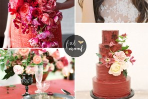
Pink Yarrow: “Tropical and festive, Pink Yarrow is a whimsical, unignorable hue that tempts and tantalizes,” according to Pantone!
Kale: Kale is a breath of fresh mountain air – perfect to use with pine and evergreen floral arrangements in a mountain wedding.
Hazelnut: This is a great choice for your earthy, neutral base colour. With just a hint of purple, it allows for either feminine touches or gender-neutral with classic contemporary decorative elements.
![]()

Nice listing , thank you for sharing the amazing colors.